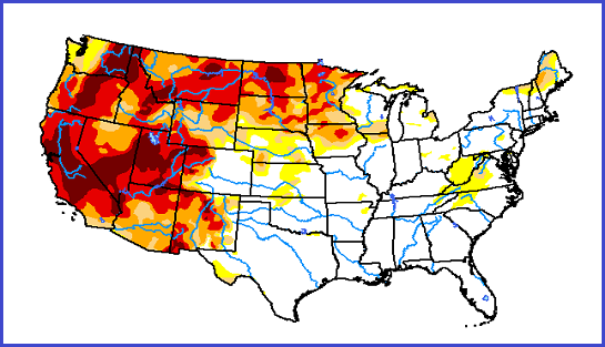
The U.S. Drought Monitor
A combination of powerful data and firsthand reports
By Trends Staff
The U.S. Drought Monitor is “a partnership between the National Drought Mitigation Center at the University of Nebraska-Lincoln, the United States Department of Agriculture, and the National Oceanic and Atmospheric Administration.”
It is not the typical sort data visualization we highlight. In fact, it is not even a data visualization. Instead, it is a website with many different maps, tables, time series, graphs, downloads, and data visualizations.
From the homepage, clicking on different areas on the U.S. map will zoom in, allowing states to be clicked and counties if a state is clicked. But before diving in, scroll to the bottom of the homepage to see all the options for the U.S. Regional and state views do not offer quite as much information, will be found in the same place – below the map, scroll down to access.
The more you zoom in, the information on each webpage changes to reflect each area – including the downloads offered. For example, when viewing the U.S. map, information (including downloads) will reflect the U.S. When viewing the U.S. western region, information will reflect the U.S. western region, and so on for states and counties.
The Condition Monitoring Observer Reports website, a part of the U.S. Drought Monitor, consists of a collection of reports submitted by locals. They might be from residents, farmers, or anyone who wants to report local conditions. Reports might include photos observers uploaded with “past and present”, or anecdotes such as “Lived here 30-years and have not seen it this bad before”, but this is also first-hand information provided by people with boots on the ground.