Climate Stripes: A Visual History of Temperature and Precipitation
by Trends Staff
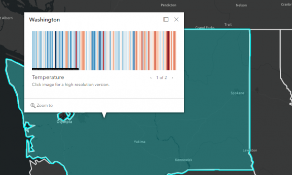
Climate Stripes is a graphical visualization of annual temperatures and precipitation averages. The project uses data from NOAA (National Centers for Environmental Information) and spans 125 years; 1895 through 2022. Visitors can click though barcode-style graphs showing the variation of yearly averages in relation to a long-term average. In temperature charts, warmer temperatures are represented oranges and reds, while cooler temperatures are represented by shades of blue. White lines signify little to no change. Precipitation is shown in a similar way, with brown representing dryer years and green showing the opposite. Darker shades in in both visualizations indicate harsher extremes.
Visitors can explore stripes by state or county. Washington State overall has suffered less severe temperature increases than the rest of the country. Coastal States in particular show an exceptionally harsh delineation towards the later end of the time range. Locally, both Benton and Franklin Counties have experienced hotter temperatures in recent years, with Franklin County’s being more severe.
The graphics are intended to be simple and impactful. The intention being to cultivate conversations about the warming world. Visitors inspired by these images are encouraged to use The Climate Explorer, which can be found by selecting the “Future climate” Tab.
This project is a creation of Ed Hawkins a climate scientist at the University of Reading (UK) and a lead contributor for the Intergovernmental Panel on Climate Change 6th Assessment Report. You can visit the original project site from the University of Reading here.