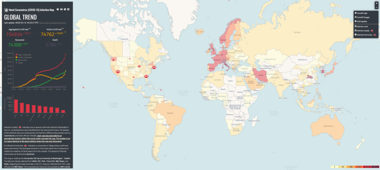
With new confirmed cases of Novel Coronavirus (COVID-19) growing each day, it’s not easy keeping track of what’s happening very near us, in the state, across the nation, and around the globe.
Designed specifically to measure “where and how many people are infected”, the Novel Coronavirus (COVID-19) Infection Map, by University of Washington geographer Bo Zhao, uses data from local, county, state, and U.S. Centers for Disease Control and Prevention (CDC) as the source for the U.S. Data for the global view come from the World Health Organization (WHO) and various governmental agencies in countries around the world.
For things you can do to best protect yourself and your family, we suggest the Washington State Department of Health, the Benton-Franklin Health District, and the CDC. Knowing the number and location of confirmed COVID-19 cases may or may not be comforting, but either way, you know its reliable, from quality sources, updated every few hours.
Starting with a global view, zoom in on the U.S. and Washington State for greater detail as to the location of confirmed COVID-19 cases. This works for any location in the U.S.
For a deeper look, click on the “Situational Heat Map” tab just below the graph on the left side of the webpage. You can toggle between a U.S. Rank and a Global Rank to see what other U.S. States or countries around the world are experiencing from thumbnail graphs showing the difference between the aggregated confirmed and active confirmed cases of COVID-19. Click on a state or country to see even more detail, including recoveries and deaths starting from Jan 21st.
While fighting a COVID-19 pandemic is more important than anything on Benton-Franklin Trends, they do compare if only in the sense good data, released in a timely manner, allows for informed decision-making.